Since trying Torres Chips some years ago on a family trip to Spain, I have been a die-hard fan of their products. They’re not easily found in the United States, and after visiting their website to see where I could find their products I realized that their website didn’t quite align with their packaging and branding. As a personal project, I decided to rebrand the company’s website. Torres prides themselves on producing old-fashioned, handcrafted chips. It is a more natural process that they say produces a more high-quality chip.
I wanted to showcase their handpicked products, all-real ingredients, the overall natural feel of the company, and I wanted to represent the purchase of the bag as a purchase of a fresh harvest as opposed to the conventional bag of Lay’s. The consumer must understand how unique these chips are or else it does in fact become that conventional bag of chips. For that, I decided to introduce new stylistic choices, like typographical, textural, and hand-drawn elements with a fresh color palette to stand out from the crowd. The old-fashioned feel was integral because I wanted to showcase the history of the company and their unflinching drive for a unique chip, but I still wanted to modernize the brand.
I thought about their undying relationships with farmers to cultivate their products, so I decided to go for a more rustic feel. By having the products they use pop out of the bag like a classic brown paper supermarket bag, I thought I portrayed the relationship between the two, and the relationship between these fresh products and the finished product. As for the website, I wanted to make it more interesting by introducing interactive elements while cutting down the number of pages to make for more eased reading so that consumers could easily read how and why Torres’ chips are so unique. In addition, I concocted the idea of a Torres Community Garden initiative to allow current consumers to learn about Torres’ values while introducing them to the products. This would allow the brand and consumers to give back to their environment and community, build a relationship with the brand, and appreciate their message, beliefs, and values as a company.
magazine | subway | website | instagram | guerilla
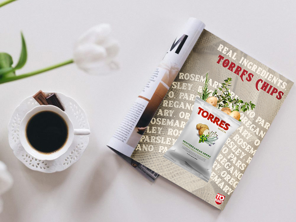
mockup of magazine ad
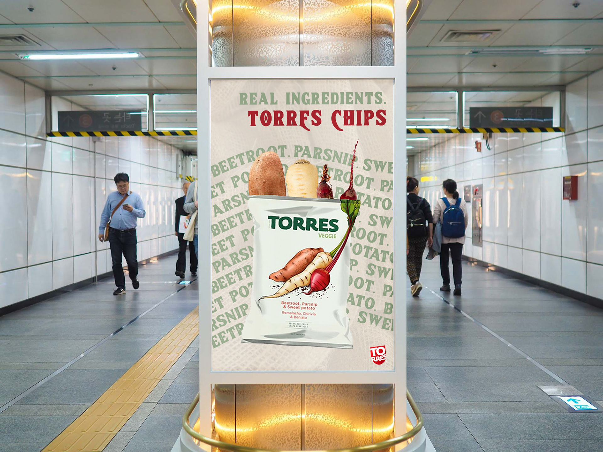
mockup of subway ad
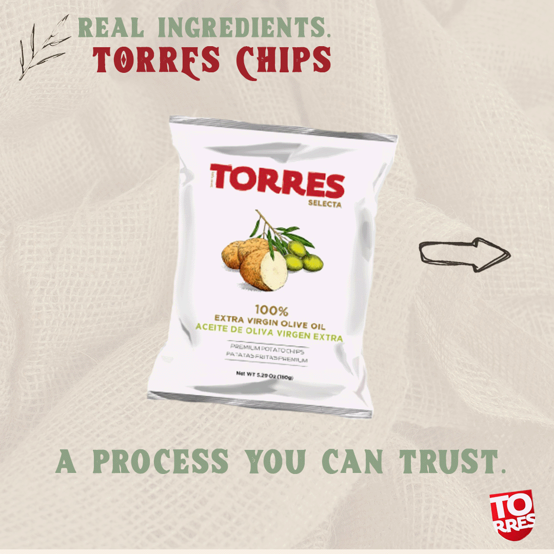
Instagram swipe through (1/7) .gif
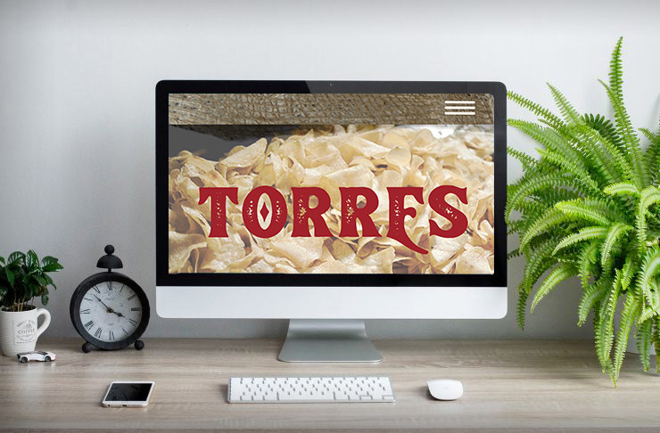
desktop mockup (1/3)
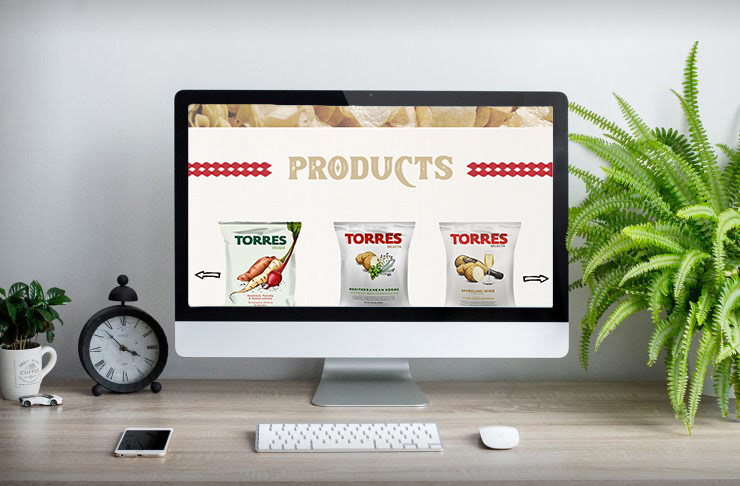
desktop mockup (2/3)
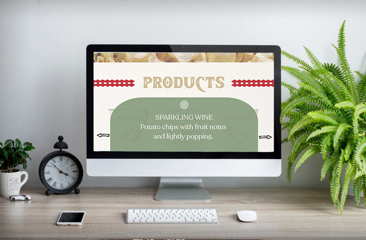
desktop mockup (3/3)
UX/UI desktop design (1/2)
UX/UI desktop mockup (2/2)
guerilla tactic: Torres Community Garden
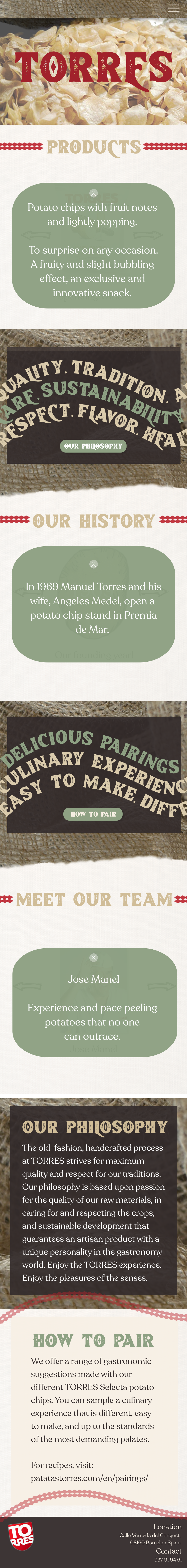
mobile mockup (1/2)
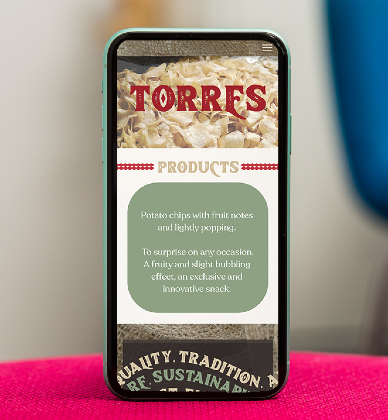
mobile mockup (2/2)
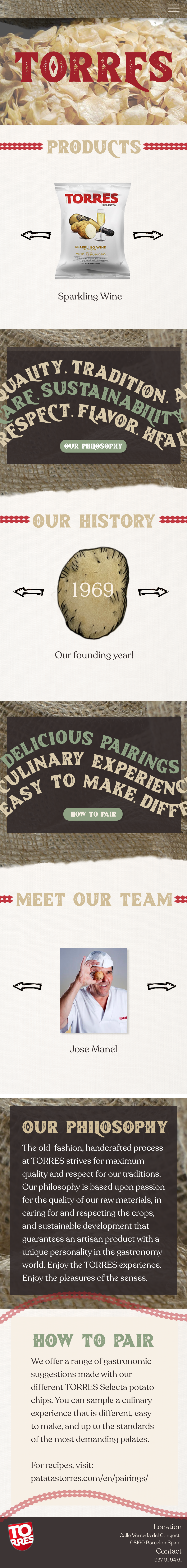
UX/UI mobile design (2/2)